Why
Calligraphy, from letters to art.
- 01
Expanding the possibilities of traditional calligraphy
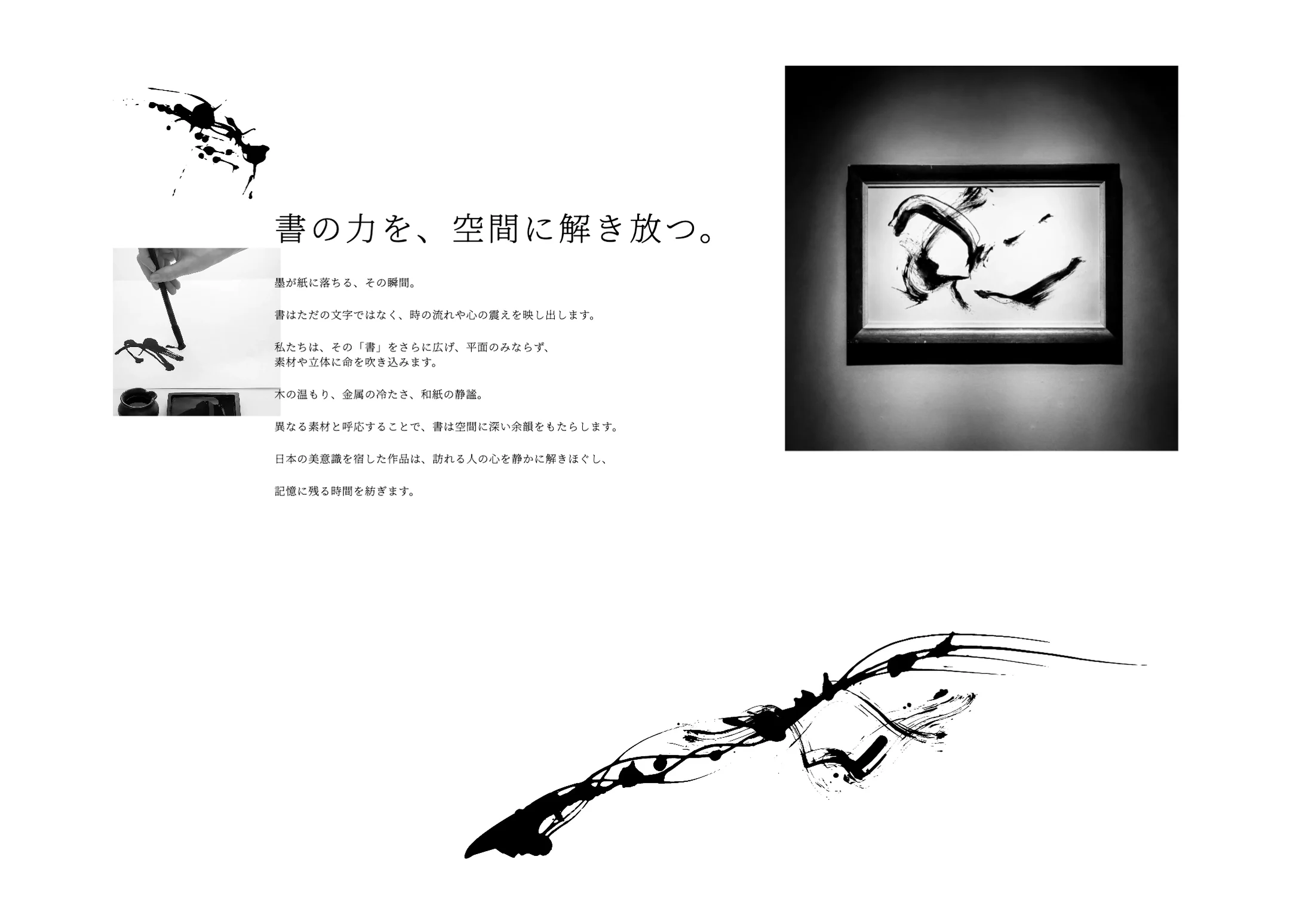
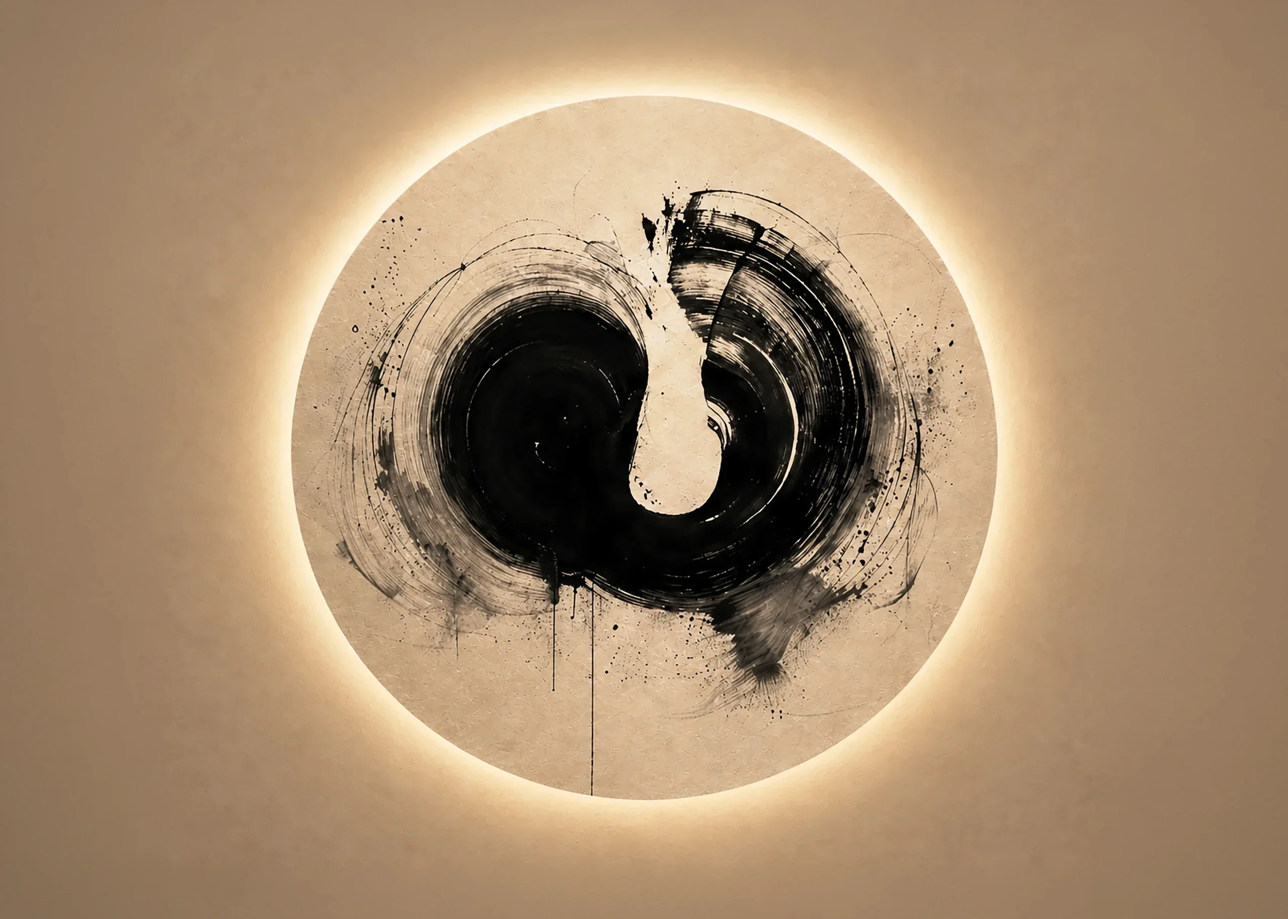
The spirit and fleeting beauty held in a single character. The value of traditional calligraphy needed to be reframed in a new context and presented not only on paper, but as art released into space.
- 02
Letting people picture the work in their own space
Calligraphic art is hard to convey on a screen alone. It needed a presentation that lets people imagine the atmosphere a piece brings to a home, an inn or an office.
- 03
Making one-of-a-kind commissions easy to begin
Listening to the client's intent, choosing materials and finishing the piece: the order-made process needed a structure that first-time clients could follow and feel comfortable asking about.
How
Ink and empty space that show the time held in calligraphy.
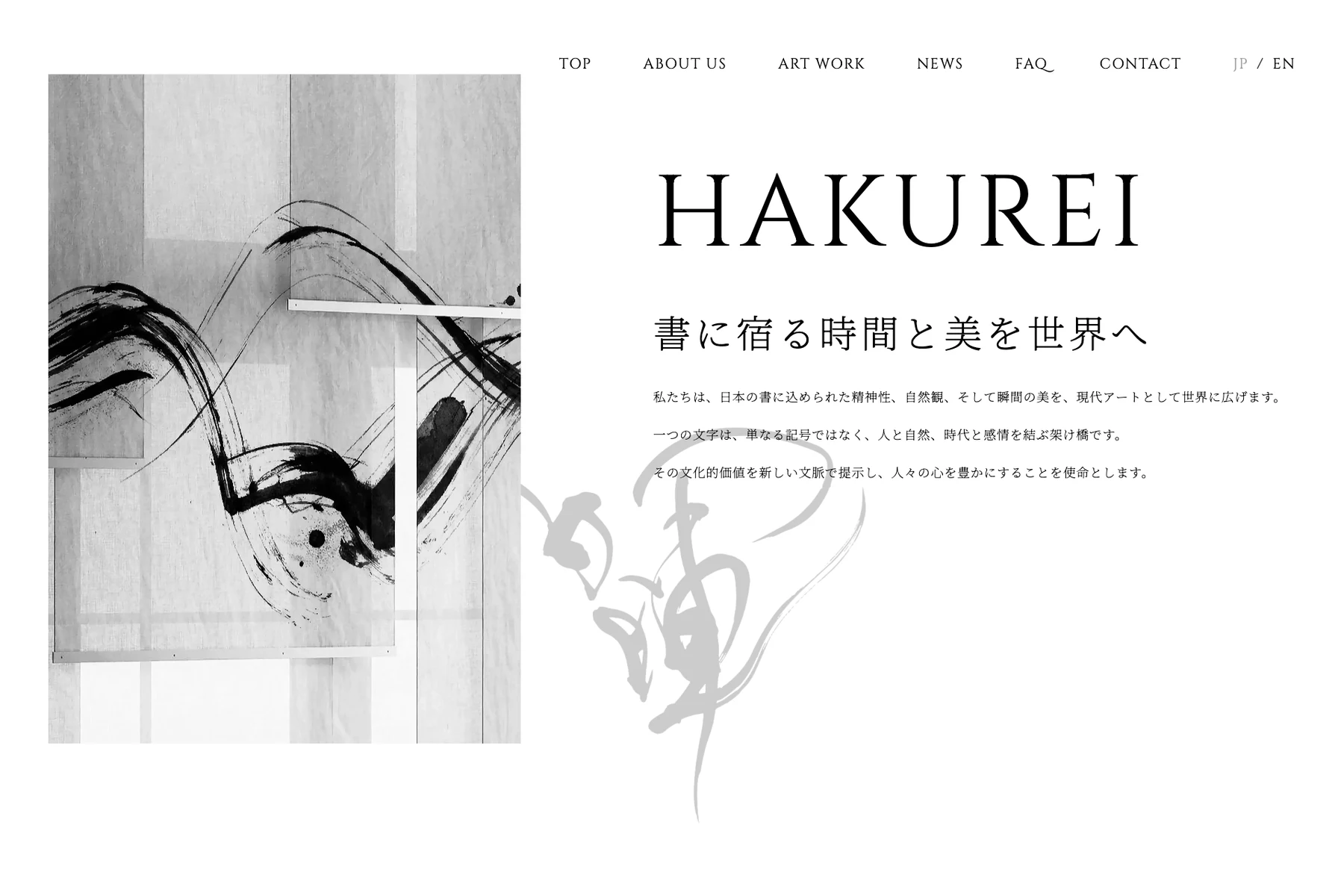
The black of ink and the white of empty space. Built on the light and shadow born of that contrast, we designed everything consistently, from the words and photography to the website.
01 Words & worldReleasing the power of calligraphy into space.
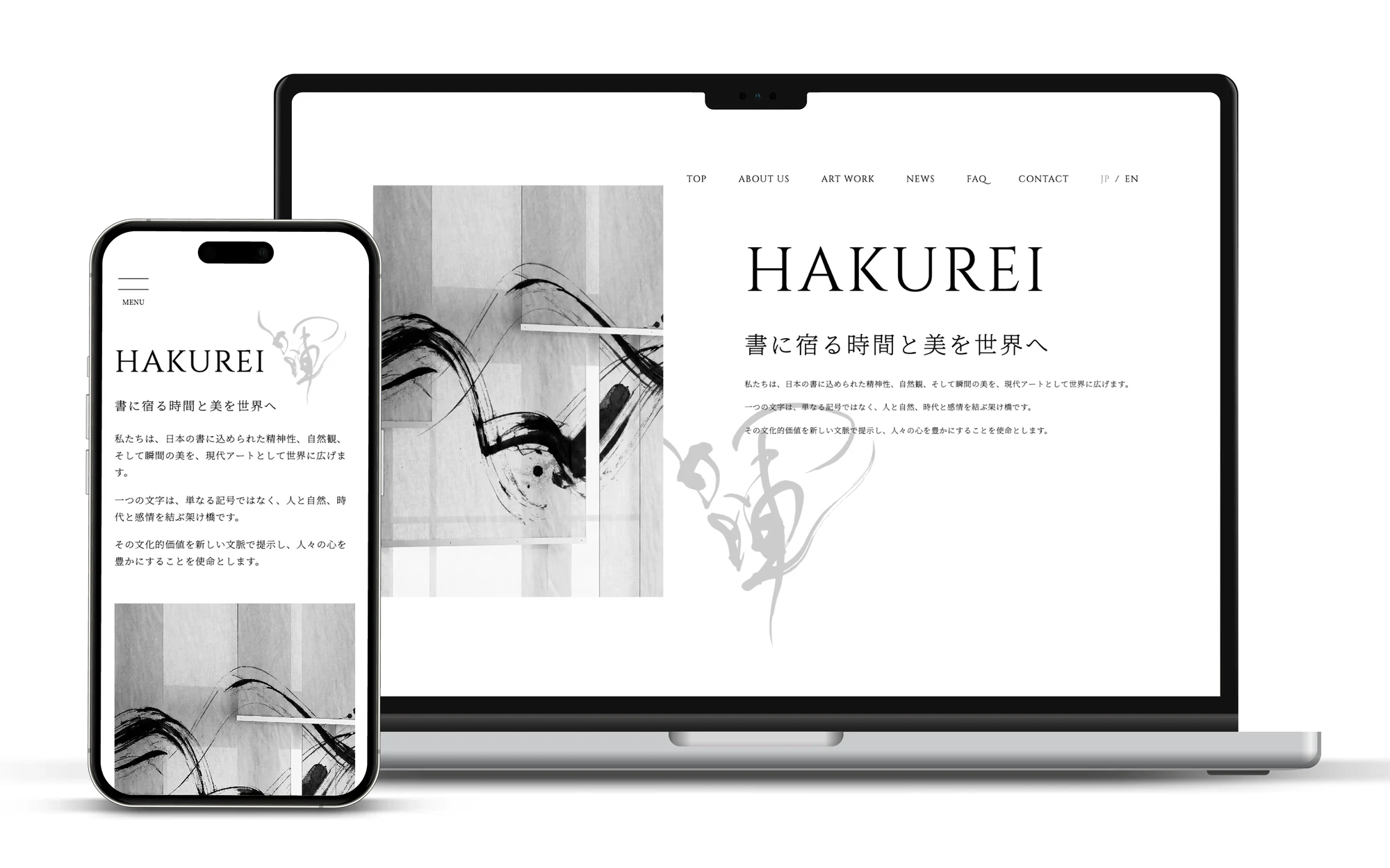
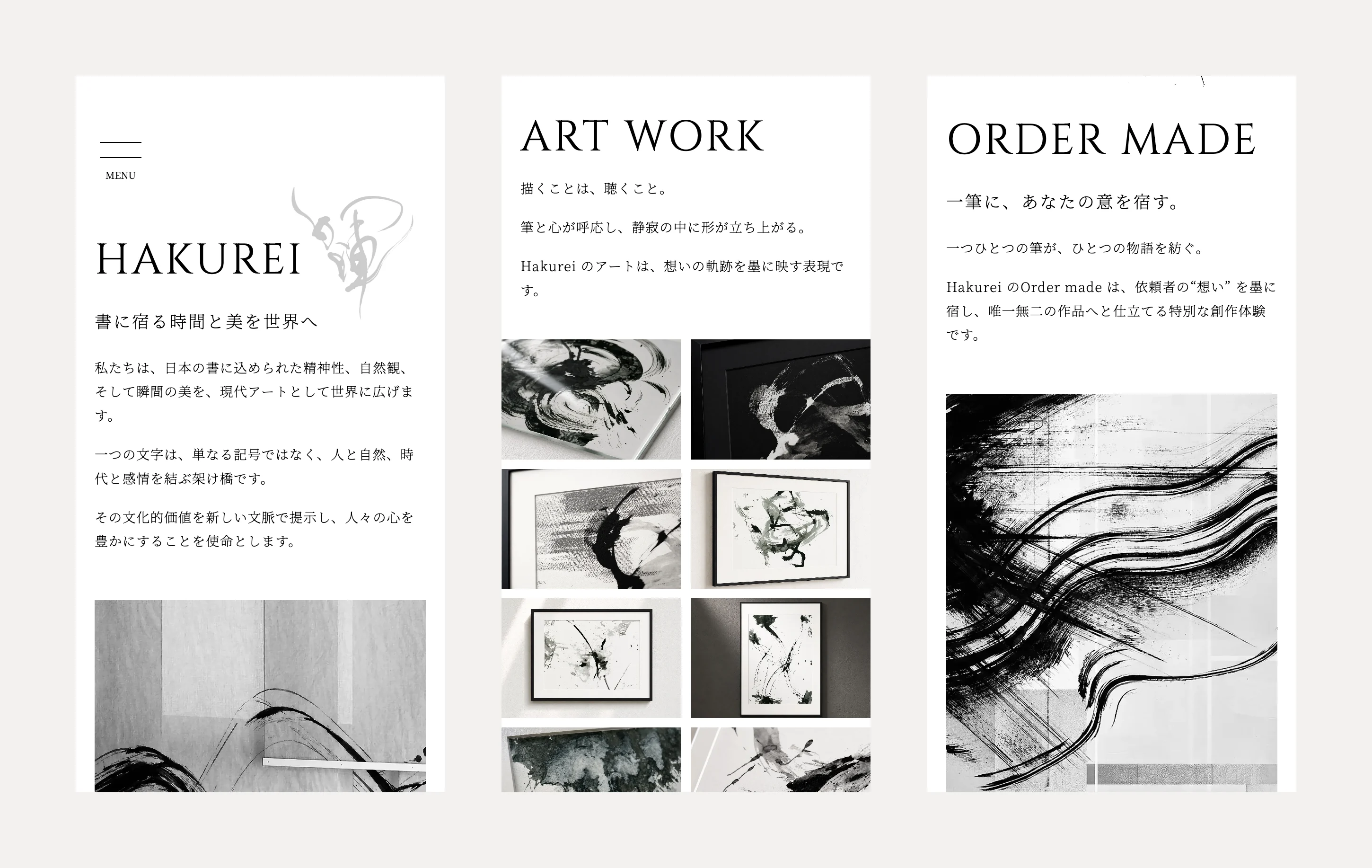
We distilled the brand's thinking into short phrases and composed the pages with Mincho type, fine Latin letters and generous white space. Photos of the works and of the brush at work convey the moment of writing.
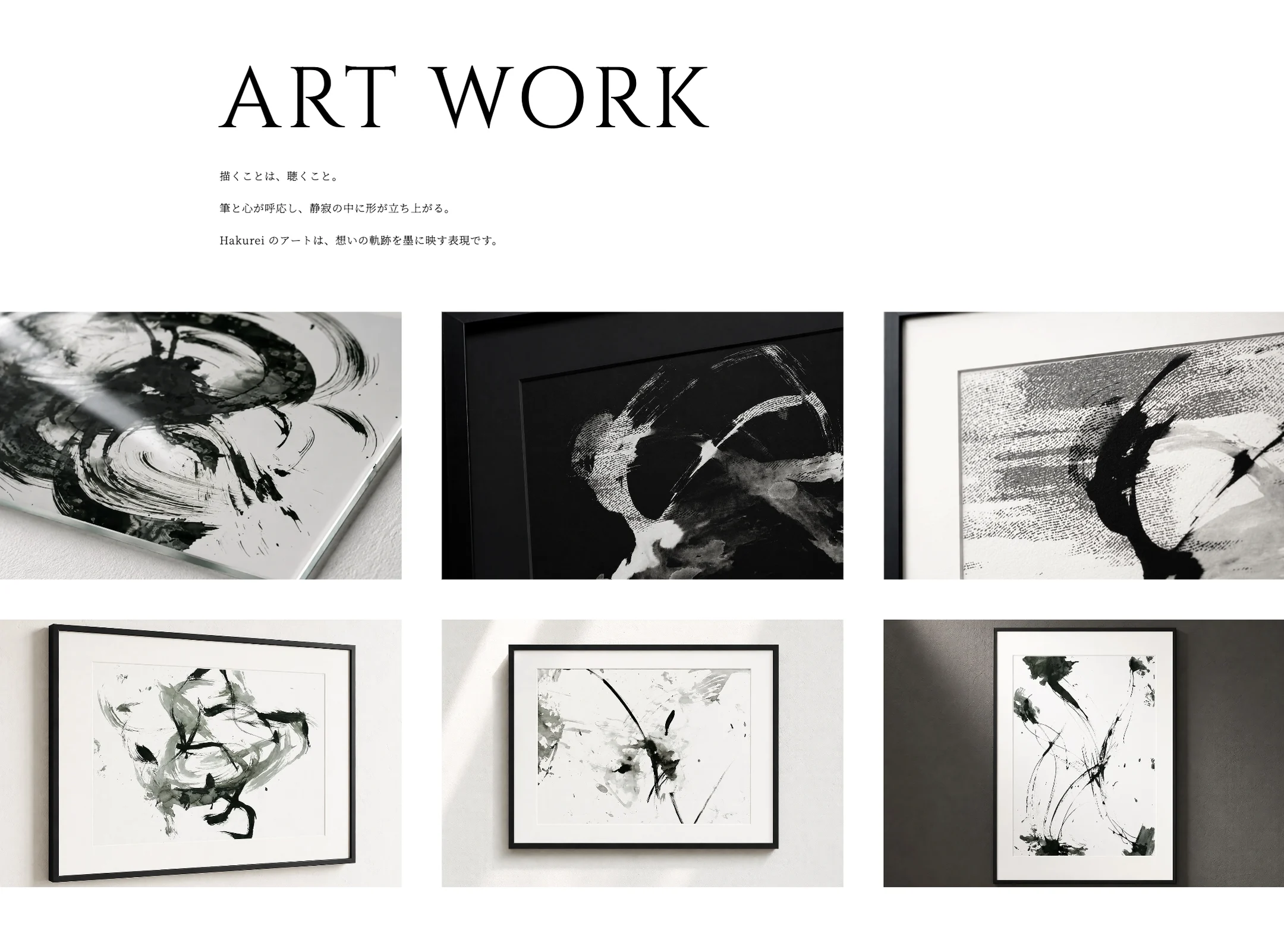
02 WorksShowing each work as it hangs.
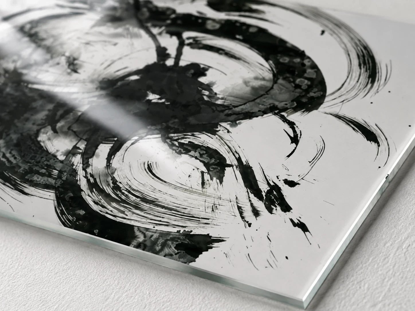
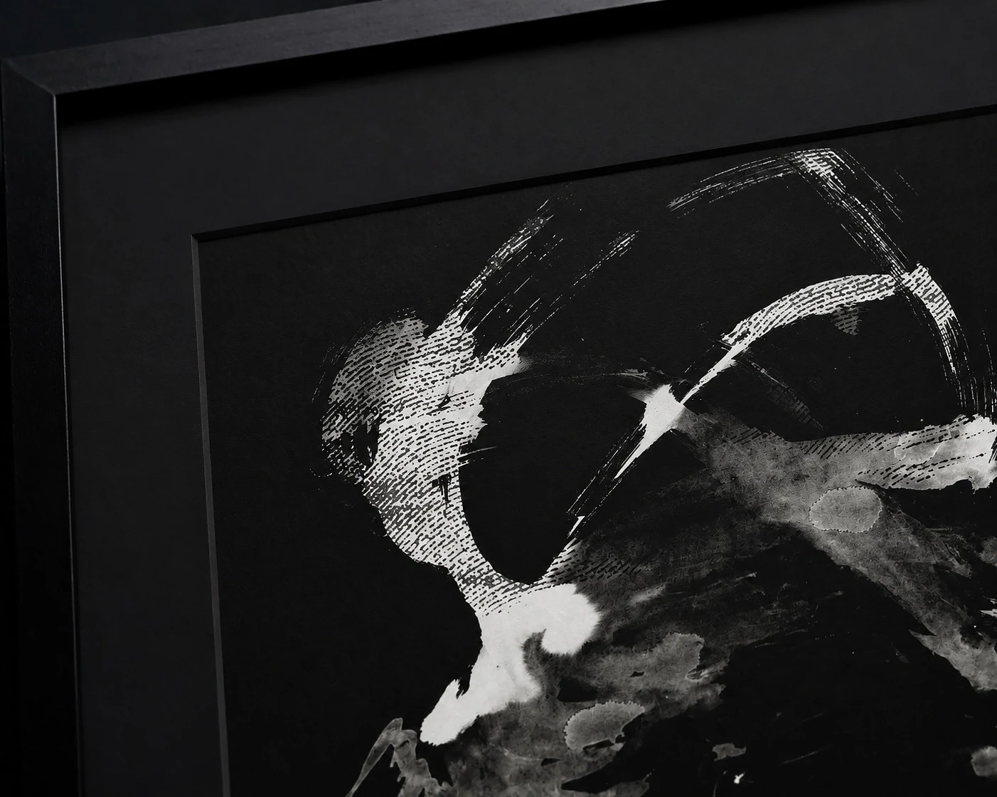
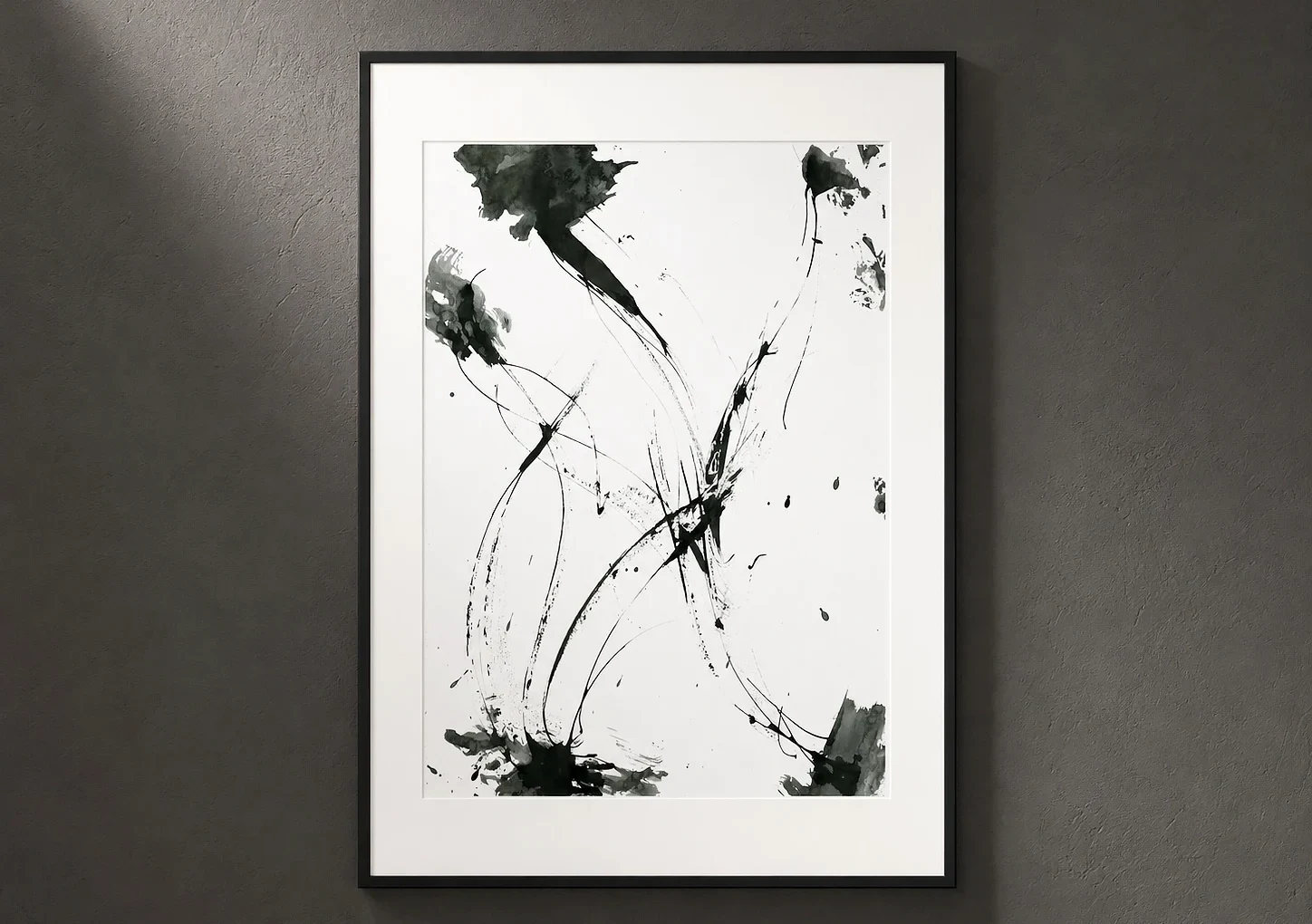
Works are shown framed, mounted in acrylic or hanging on a wall, so the texture of the materials and their relationship with the space come through. Each work also has its own detail page.
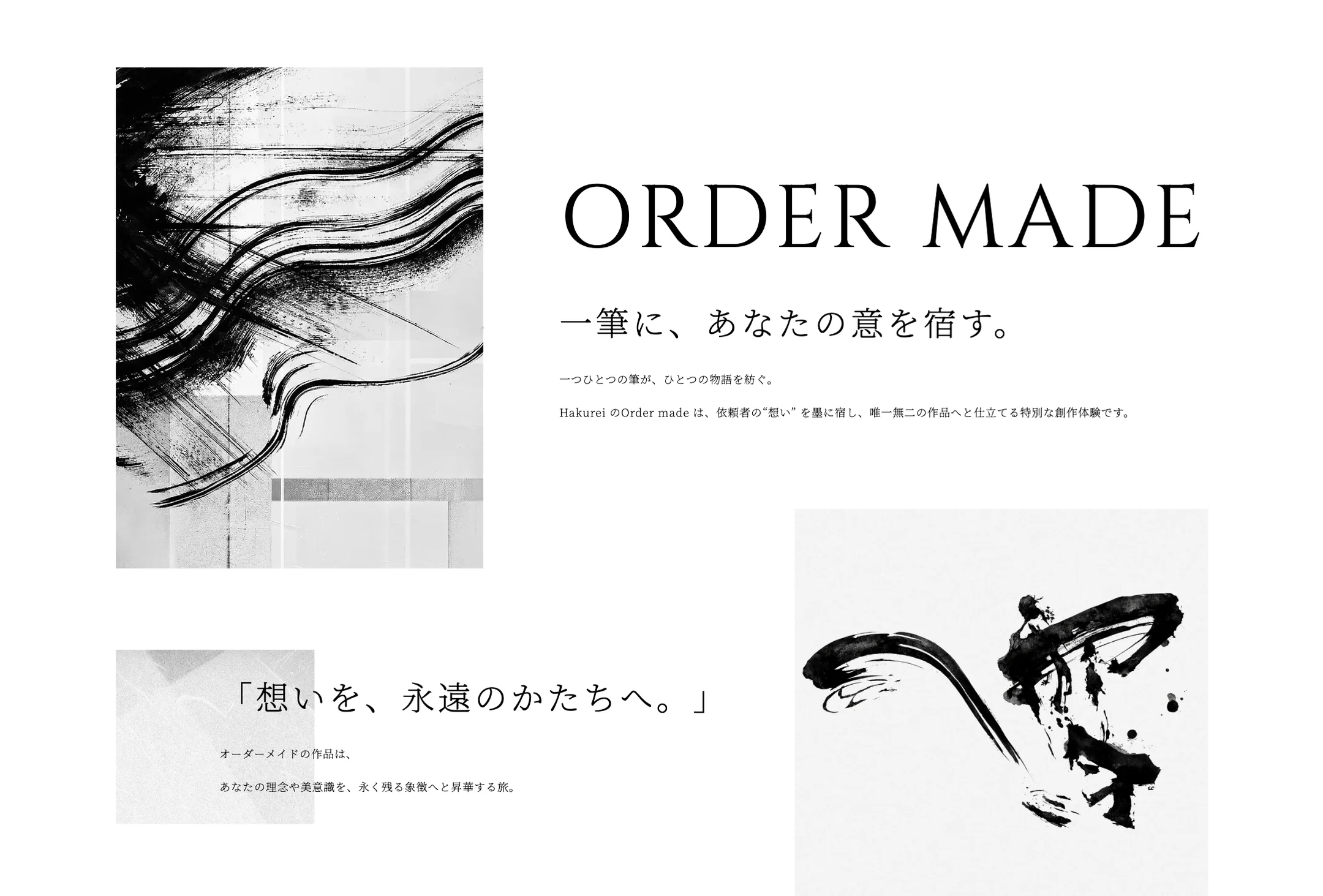
03 Order madeFrom dialogue to a one-of-a-kind piece.
Consultation, concept dialogue, creation, refinement and delivery. The order-made process is shown step by step so first-time clients can reach out with confidence.
What
A brand that delivers calligraphy as art that resonates in space.
RoleOur scope
- Brand concept & copy
- Web design
- Coding & WordPress
- News & column feature
- English pages
- Naming (Hakurei)
CreditCredit
- Calligraphy: Sonobe Hakurei
- Branding, web design & development: Rootfor Inc.