Why
Polishing the shop's “face” within a tight schedule.
- 01
A presence worthy of Gion
One minute's walk from Gion-Shijo Station. The location called for a crisp, dignified atmosphere and a sense of quality to match.
- 02
A tight construction schedule, limited to the restaurant's days off
Work could only be done on the shop's regular closing days, so the plan had to be completed in limited time.
- 03
Where to focus
With so little time, we had to identify the part of the shop that most shapes its impression and focus our work there.
How
Focusing on the counter, refining the space through contrasting materials.
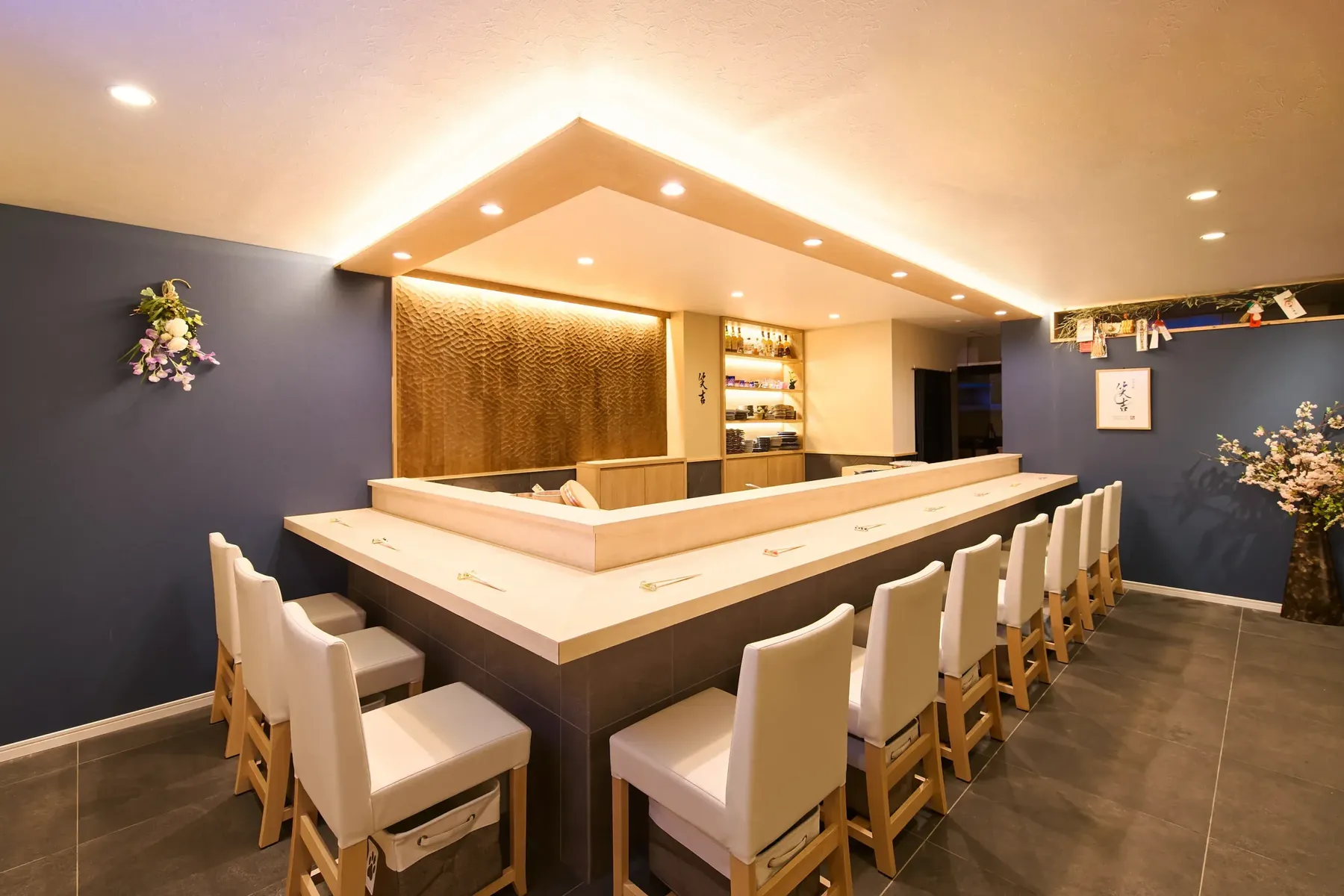
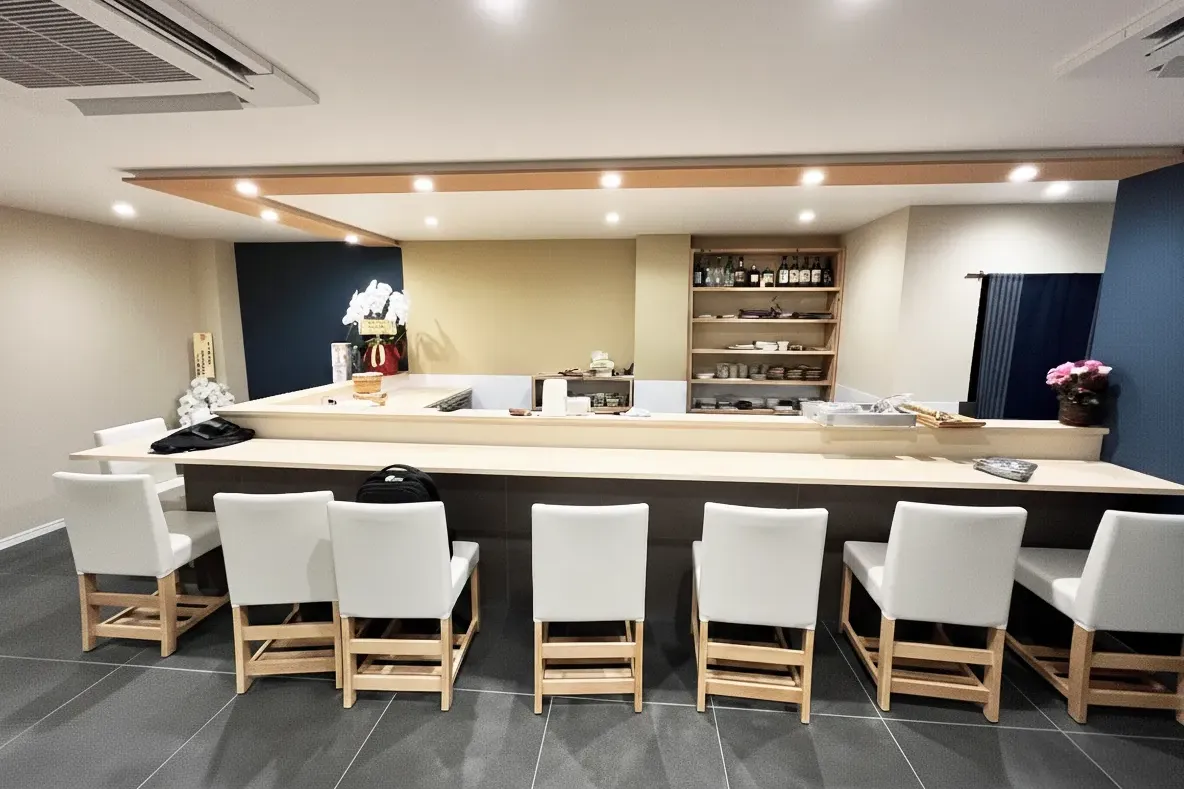
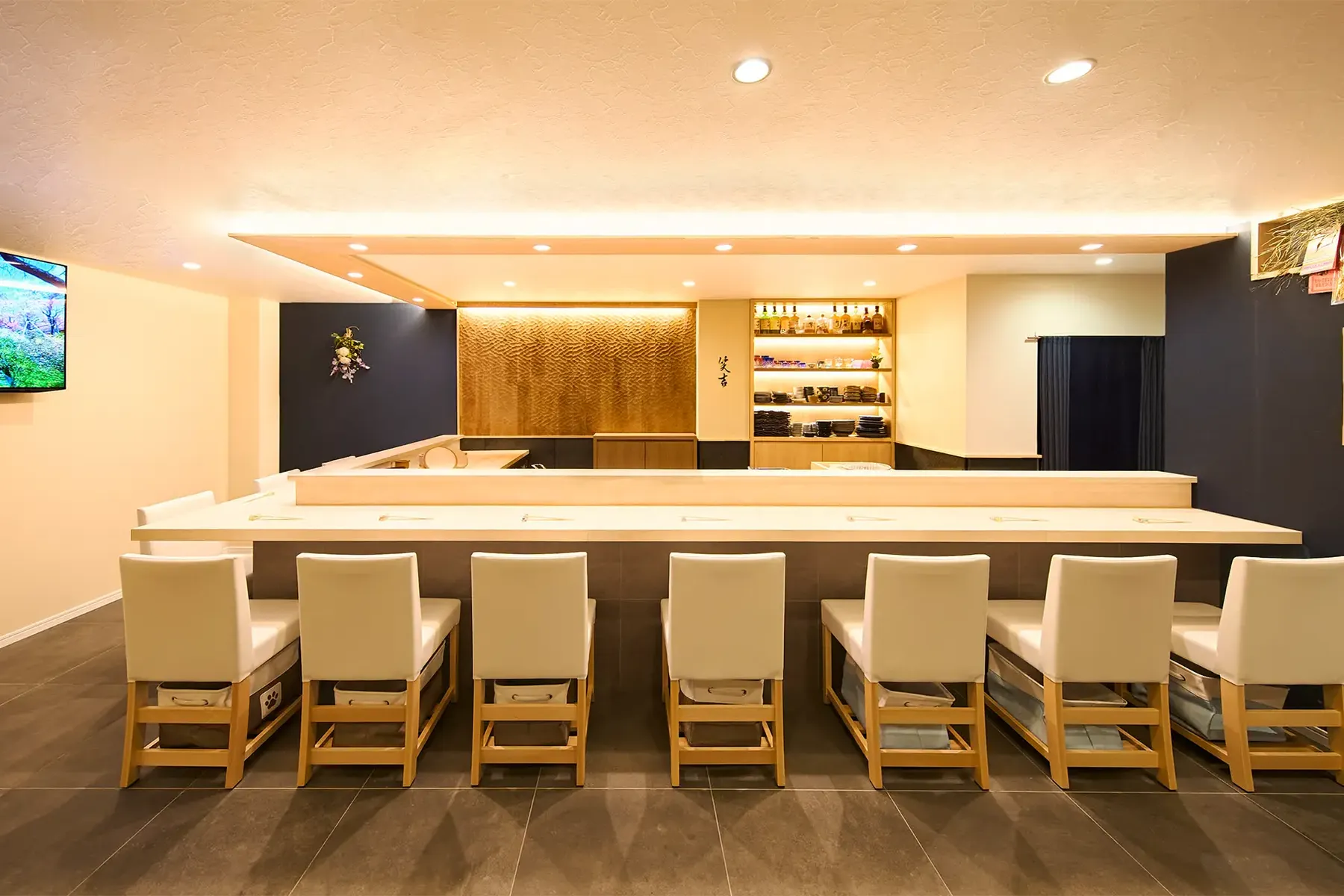
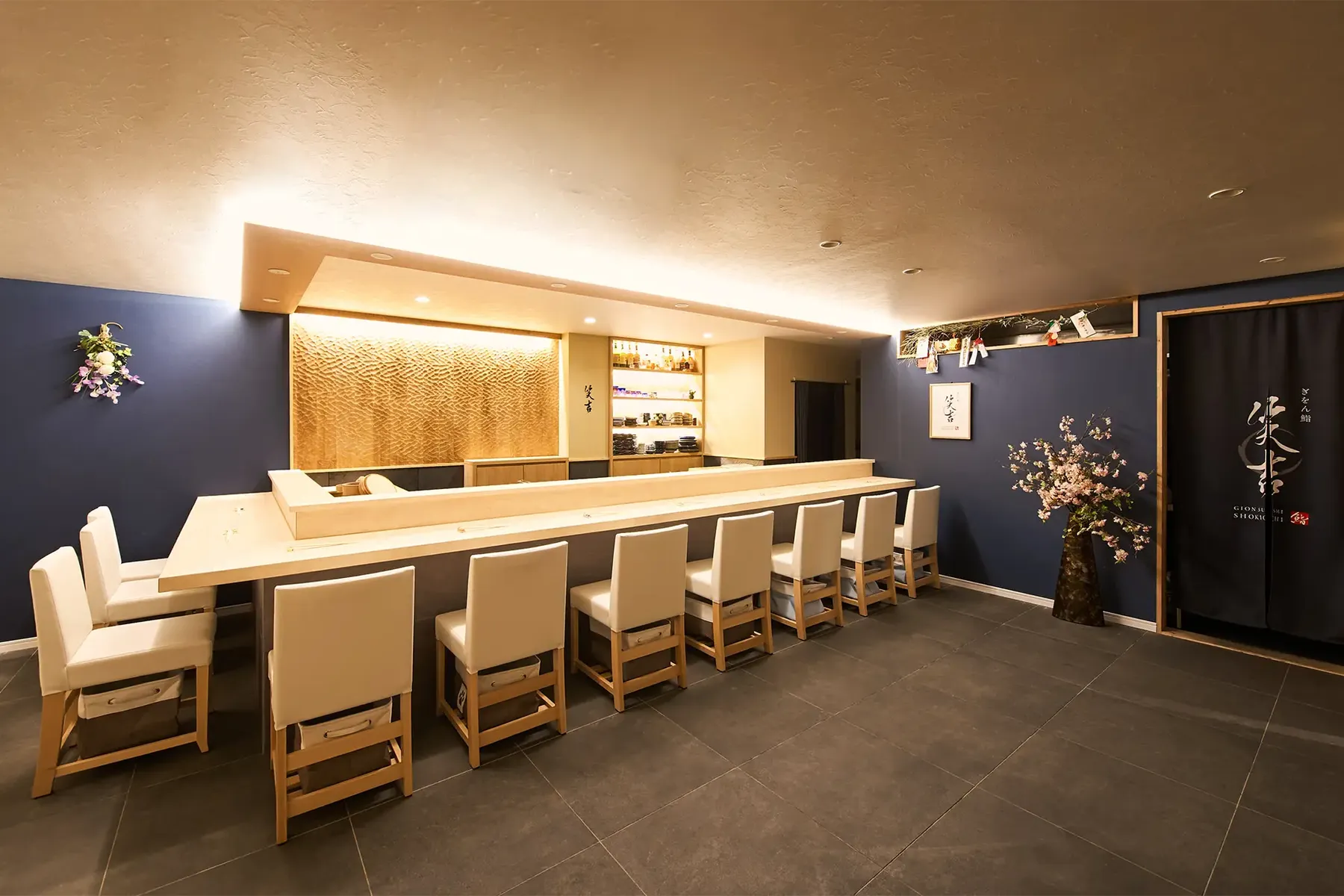
We focused on the counter area, which defines the shop's impression, and took an approach of refining the essence of the space.
01 MaterialsLetting the warmth of wood and the texture of stone resonate.
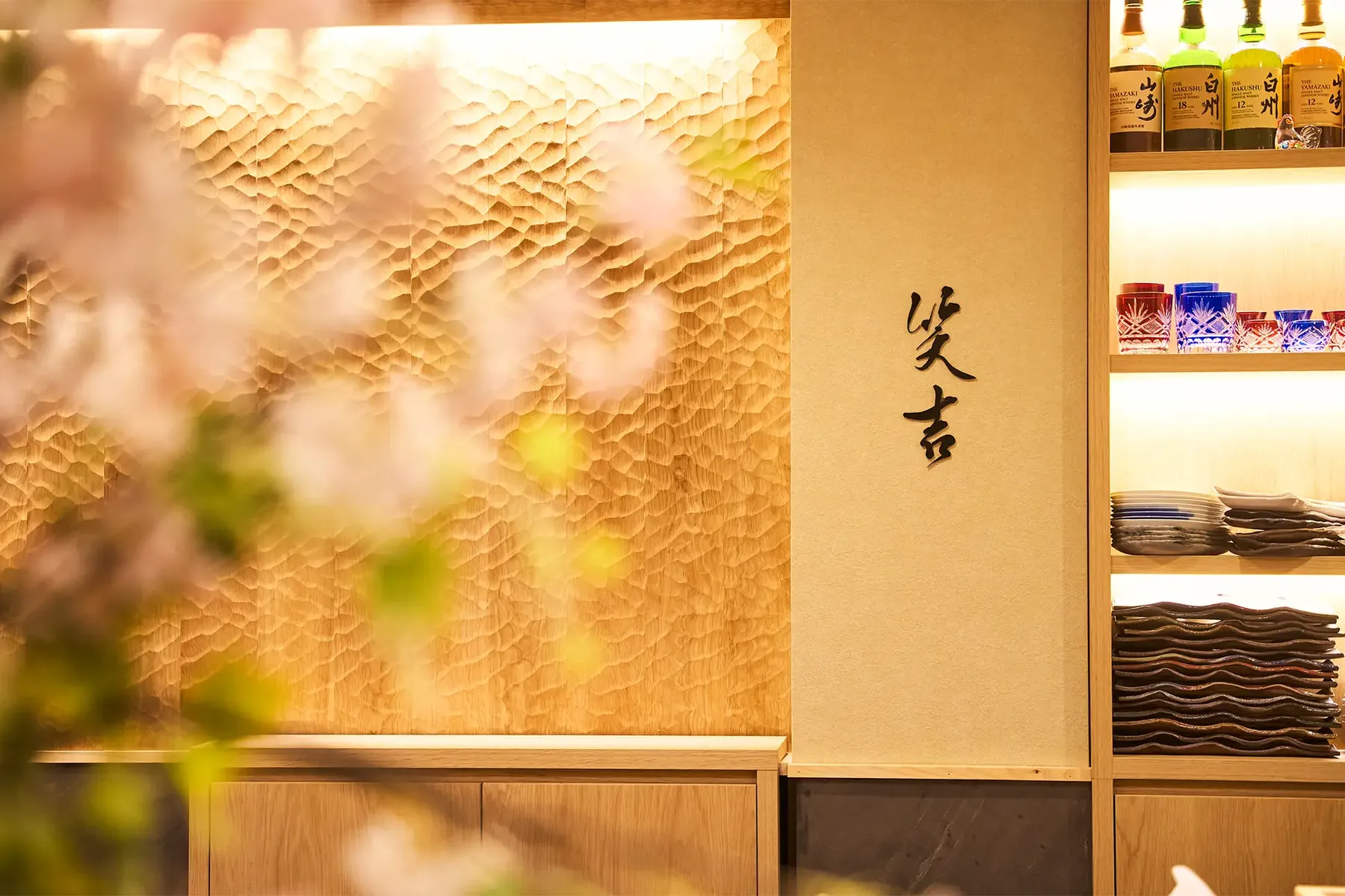
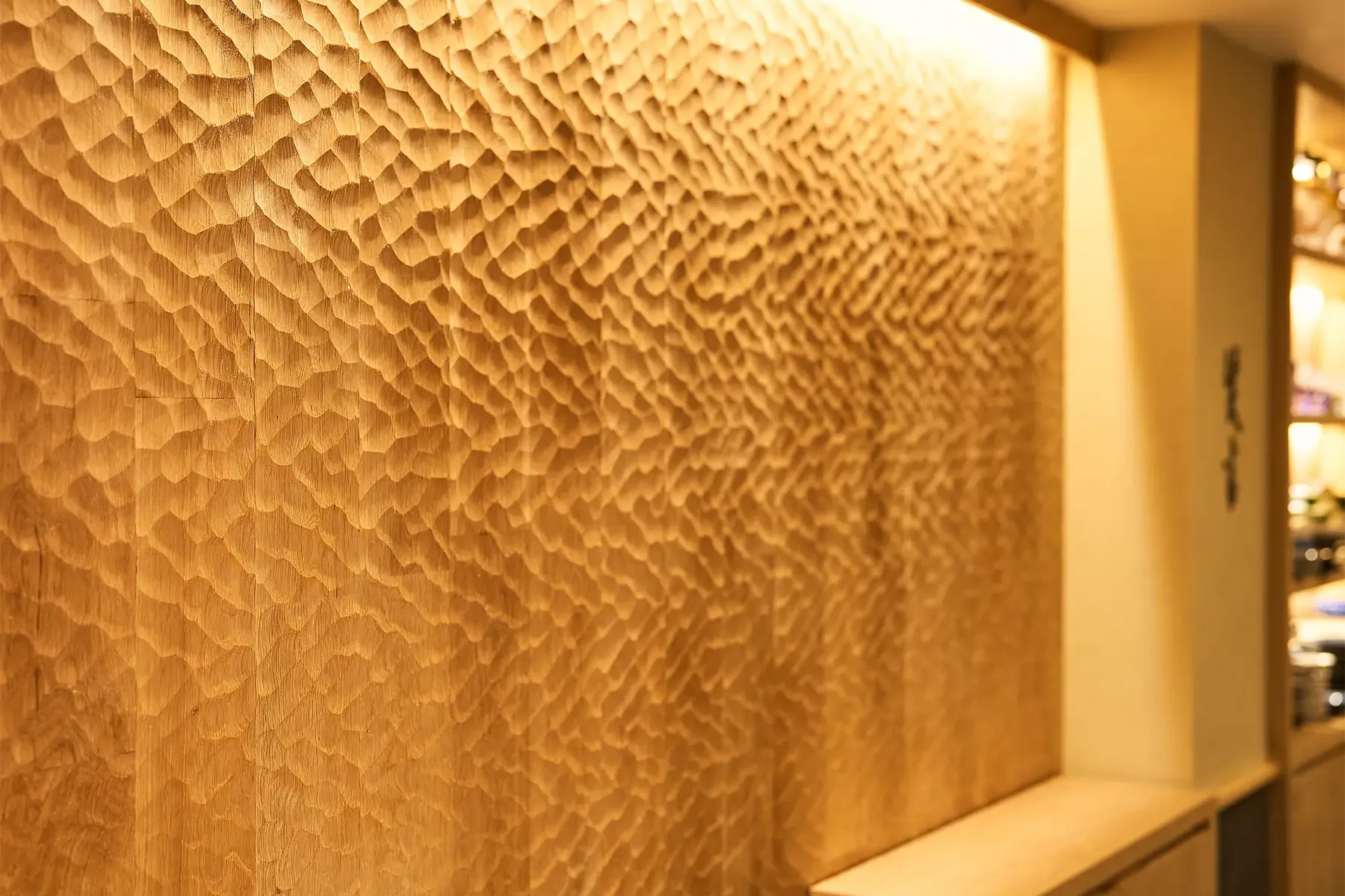
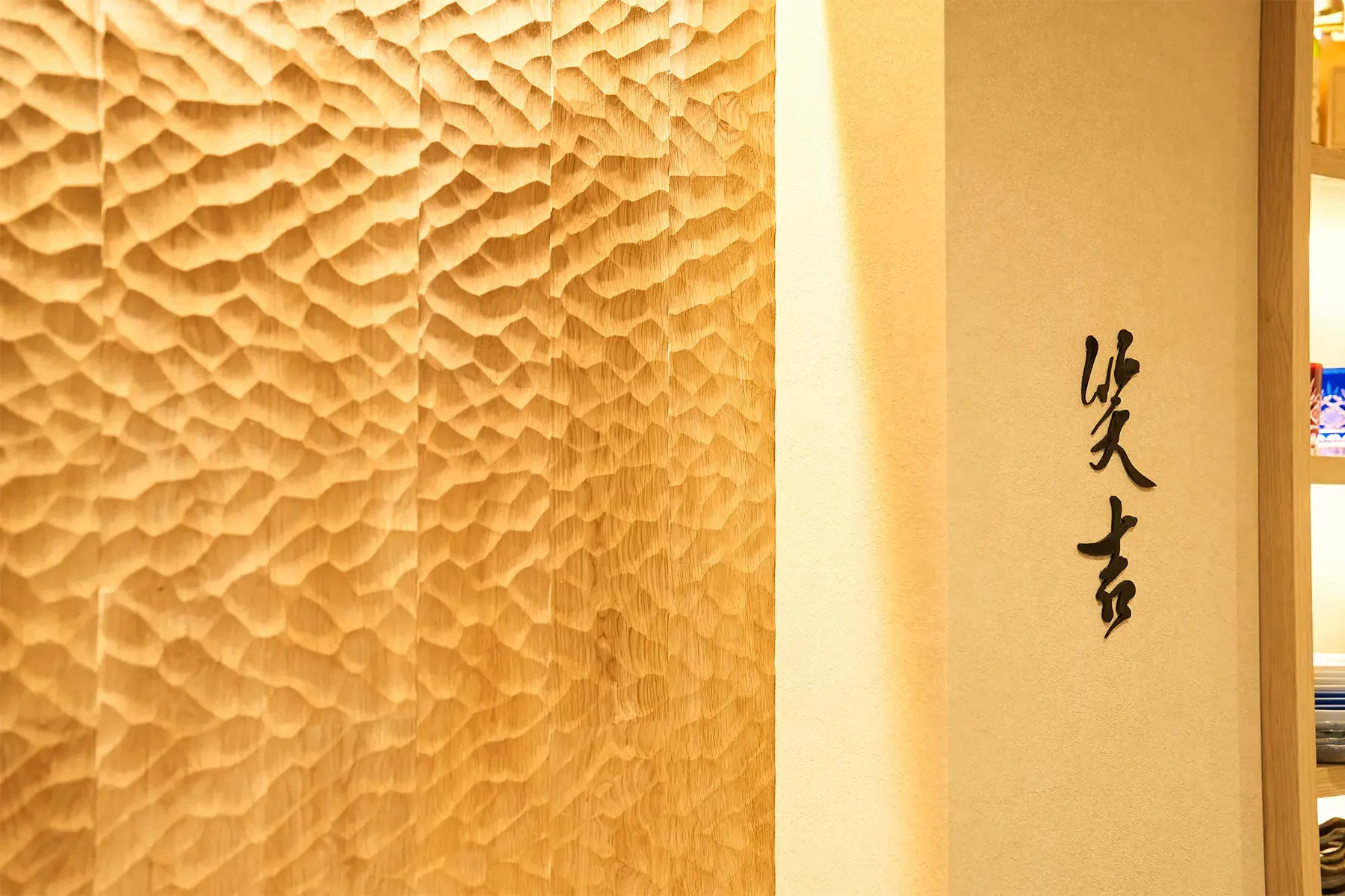
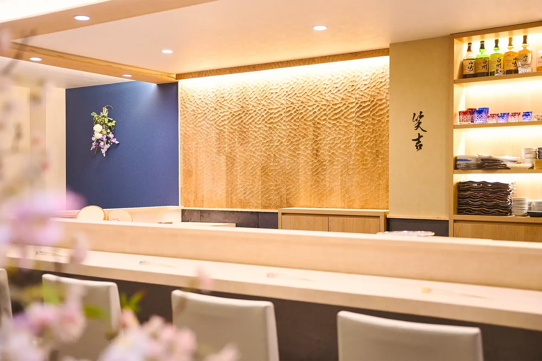
The front wall is fitted with hand-adzed (naguri) oak panels, paired below with finely sliced stone. Understated yet strong in presence, the materials bring depth and a quiet tension to the space.
02 LightIndirect lighting that brings out the adzed texture.
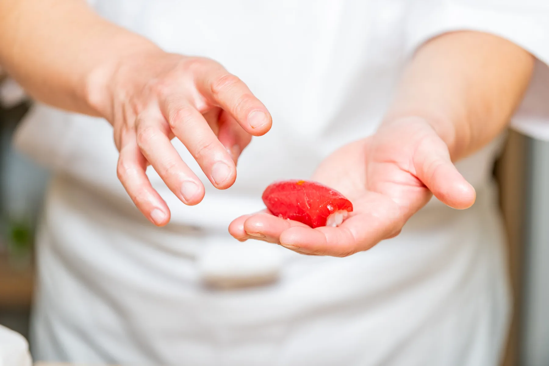
Soft indirect lighting reveals the shadows of the adzed surface. The result is a stage for slowly savoring the chef's nigiri and carefully selected sake.
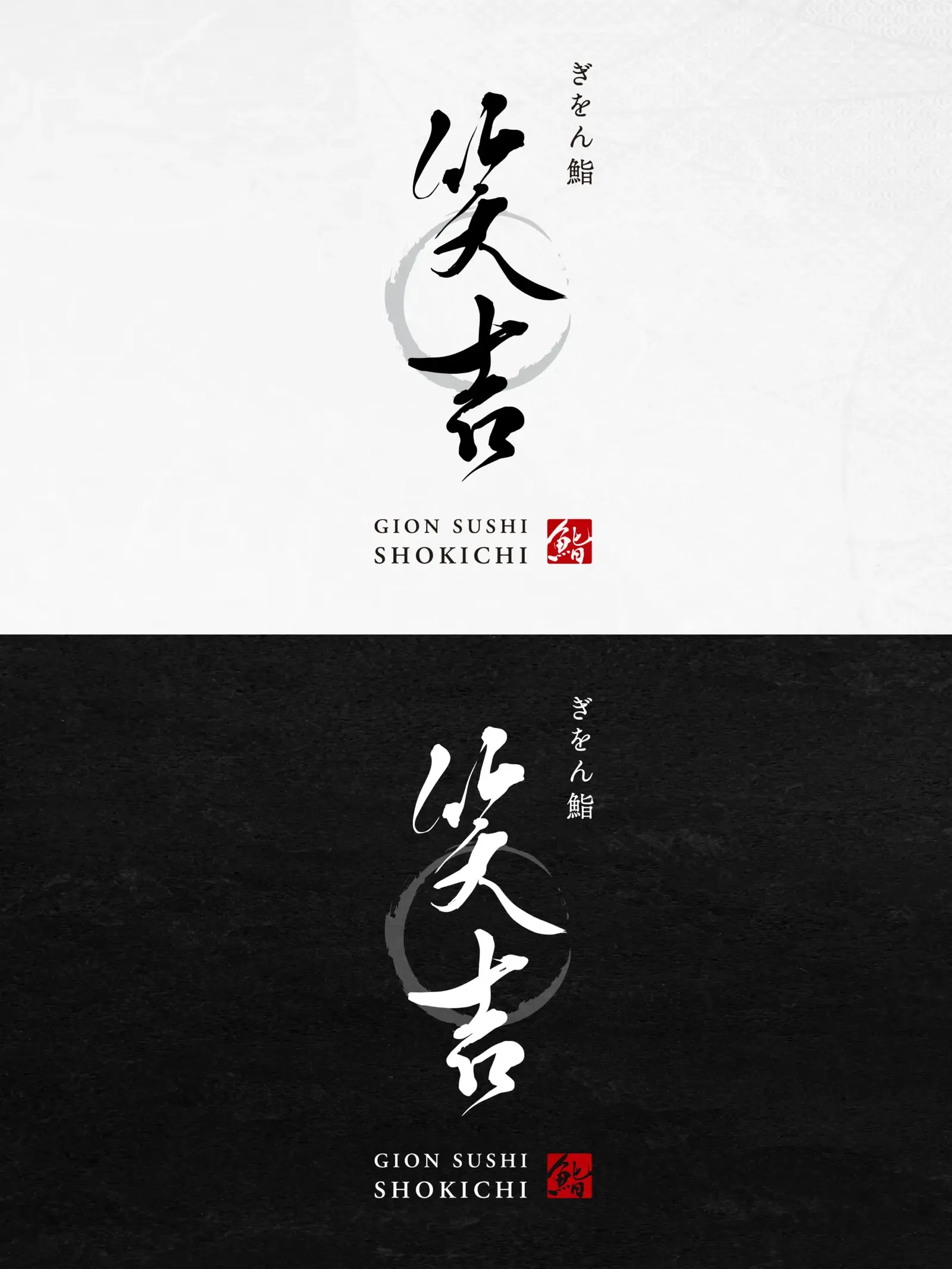
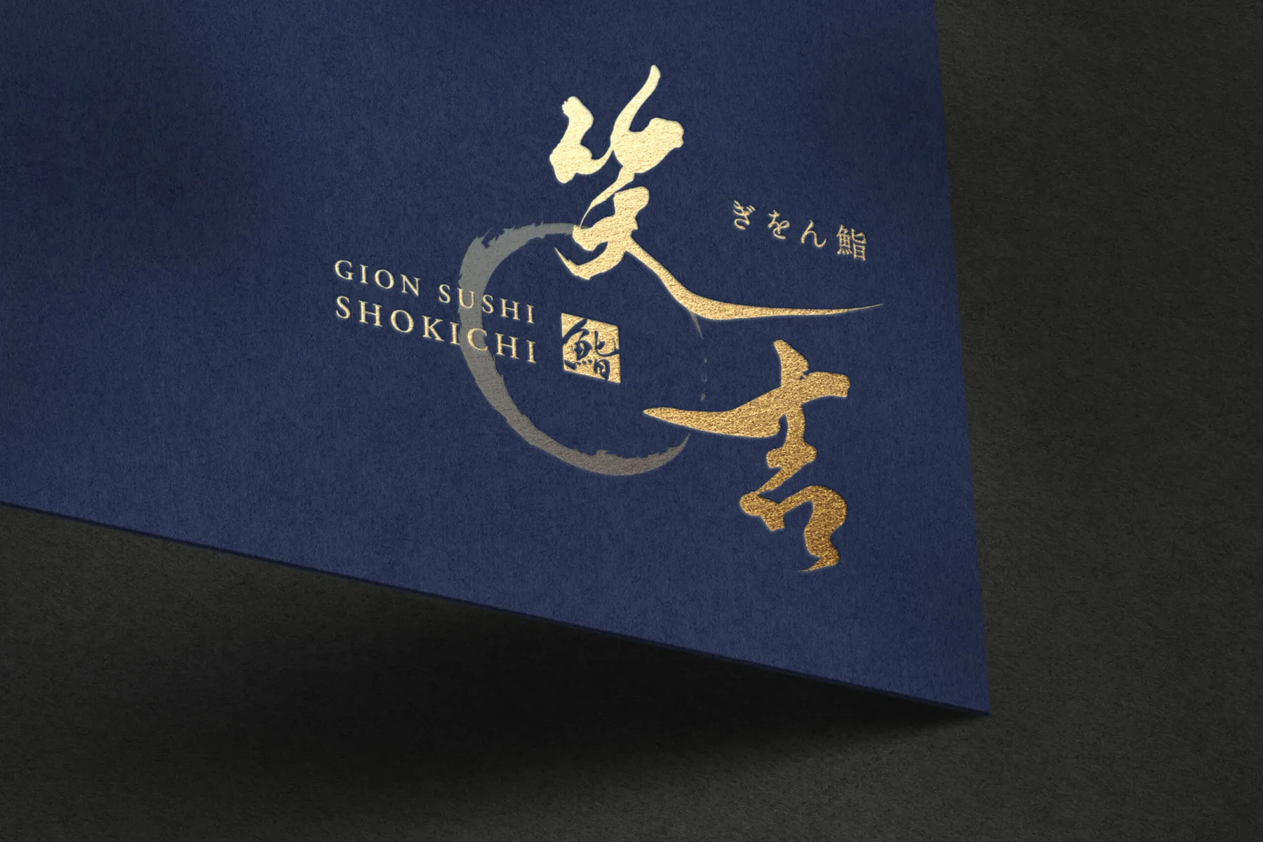
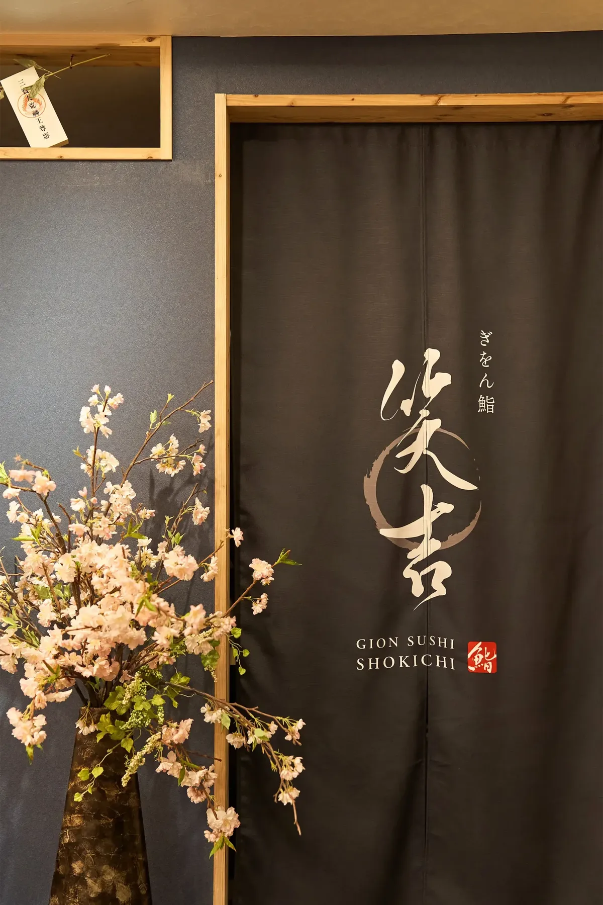
03 GraphicsA cohesive identity, from the logo to shop business cards.
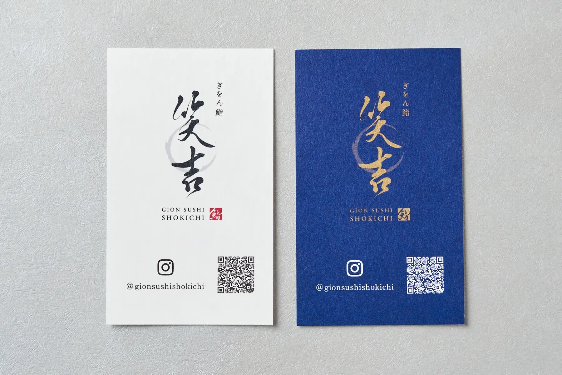
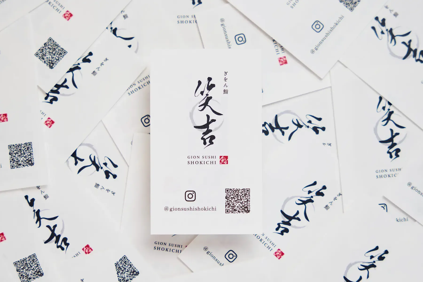
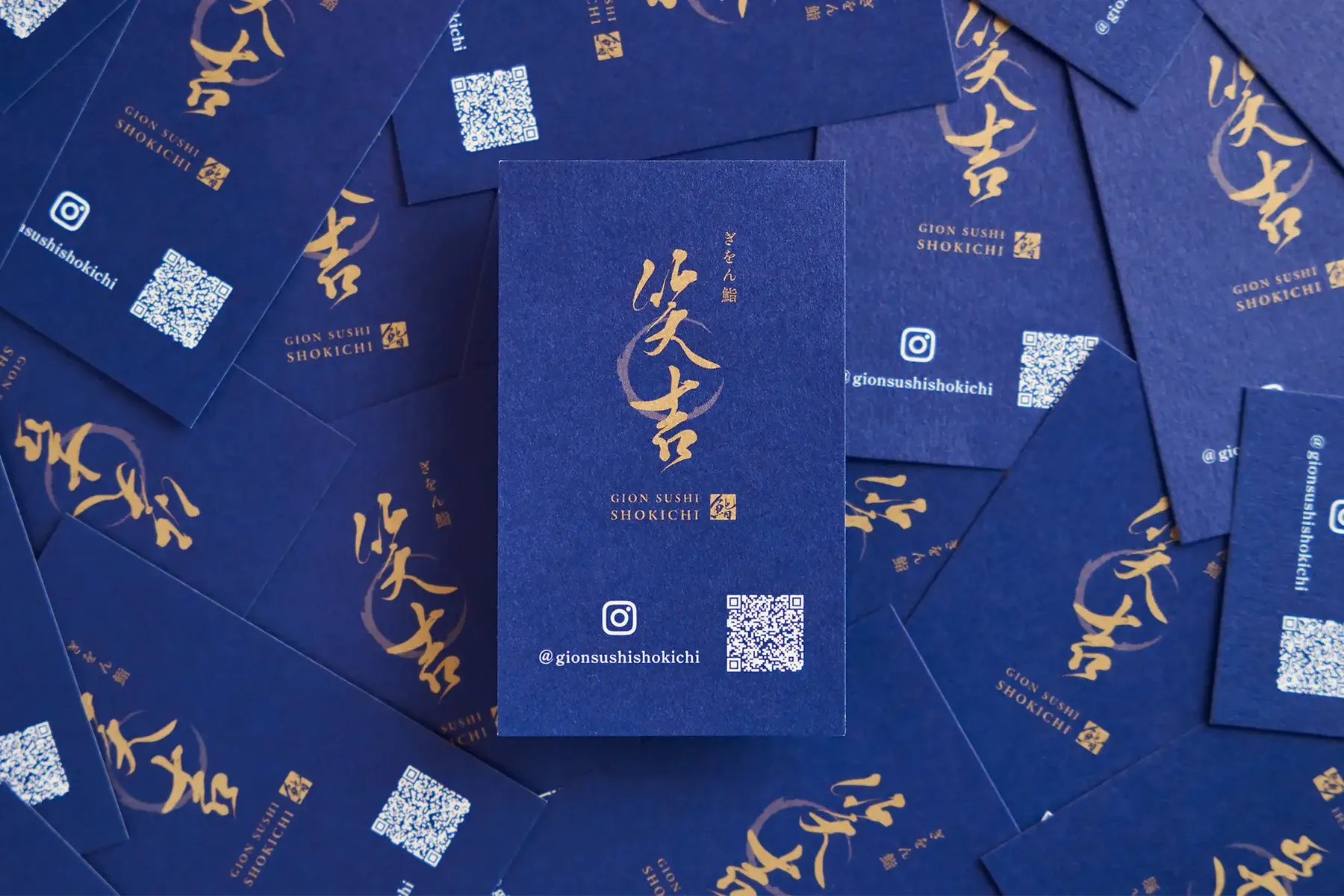
We also handled the logo design, shop cards, and photo direction, bringing them to the same level of quality as the space.